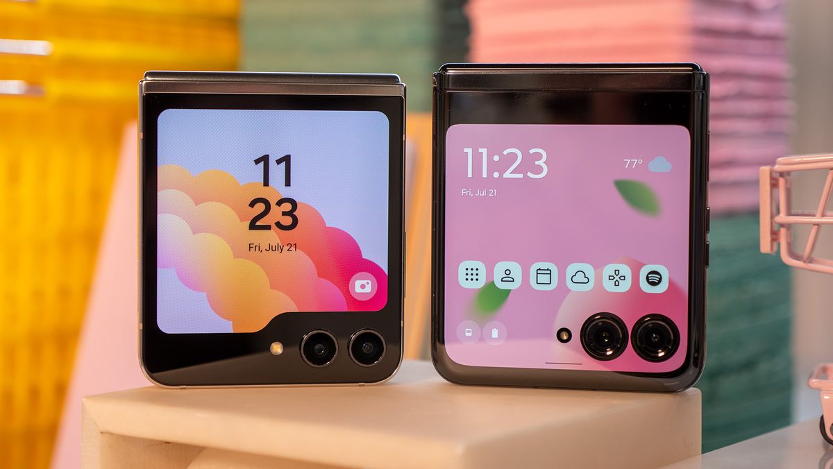
Samsung recently unveiled its new Galaxy Z Flip 5 with a prominent external display on the cover panel. The phone follows the trends set by other clamshell foldables this year, giving users more screen real estate to play with while the phone remains closed. However, while this gives users plenty of space to interact with the phone without opening it, Samsung’s approach to the cover screen still leaves a lot to be desired.
I’ve been using the Galaxy Z Flip 5 for several days now, and I couldn’t wait to set up and play with the 3.4-inch Flex Windows (Samsung’s name for the cover screen). But the more I do, the more I come to realize just how limiting the experience is, which is a bummer because there’s so much potential for a great out-of-the-box experience.
Where the Galaxy Z Flip 5 cover screen falls short
With such a prominent cover screen greeting users when the phone is closed, one would expect Samsung to really lean into this by letting users immediately access their apps from the outer display. This is something that Motorola does with the Razr Plus, which features a slightly larger 3.6-inch cover display. That phone really leans on the ability to use just about any app on the cover screen; I had hoped Samsung would do the same with the Flip 5. Unfortunately, that’s not really the case when you first turn the phone on.
Like the previous Galaxy Z Flip models, Samsung focuses on letting users access a set of widgets, which are essentially watered-down versions of some built-in apps and features. This includes weather, the calendar, a timer, contacts, the phone, and even one to easily control my Galaxy Buds 2. These are mostly fine, but interactions are as limited as the widget selection, and they’re more suited for viewing information than actually doing anything with it.
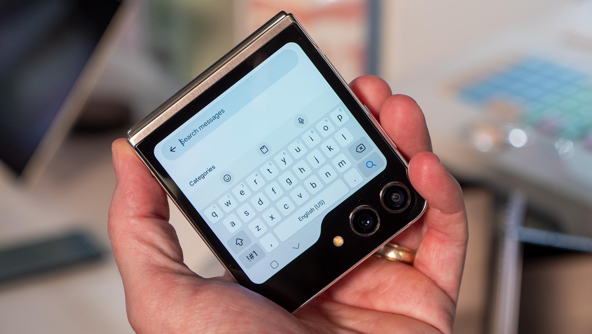
That goes for notifications, which sit on the leftmost panel. Interactions with notifications are also pretty limited, and in my use, I’ve really only been able to swipe an alert away or reply to certain notifications using Samsung Keyboard (and no other Android keyboard).
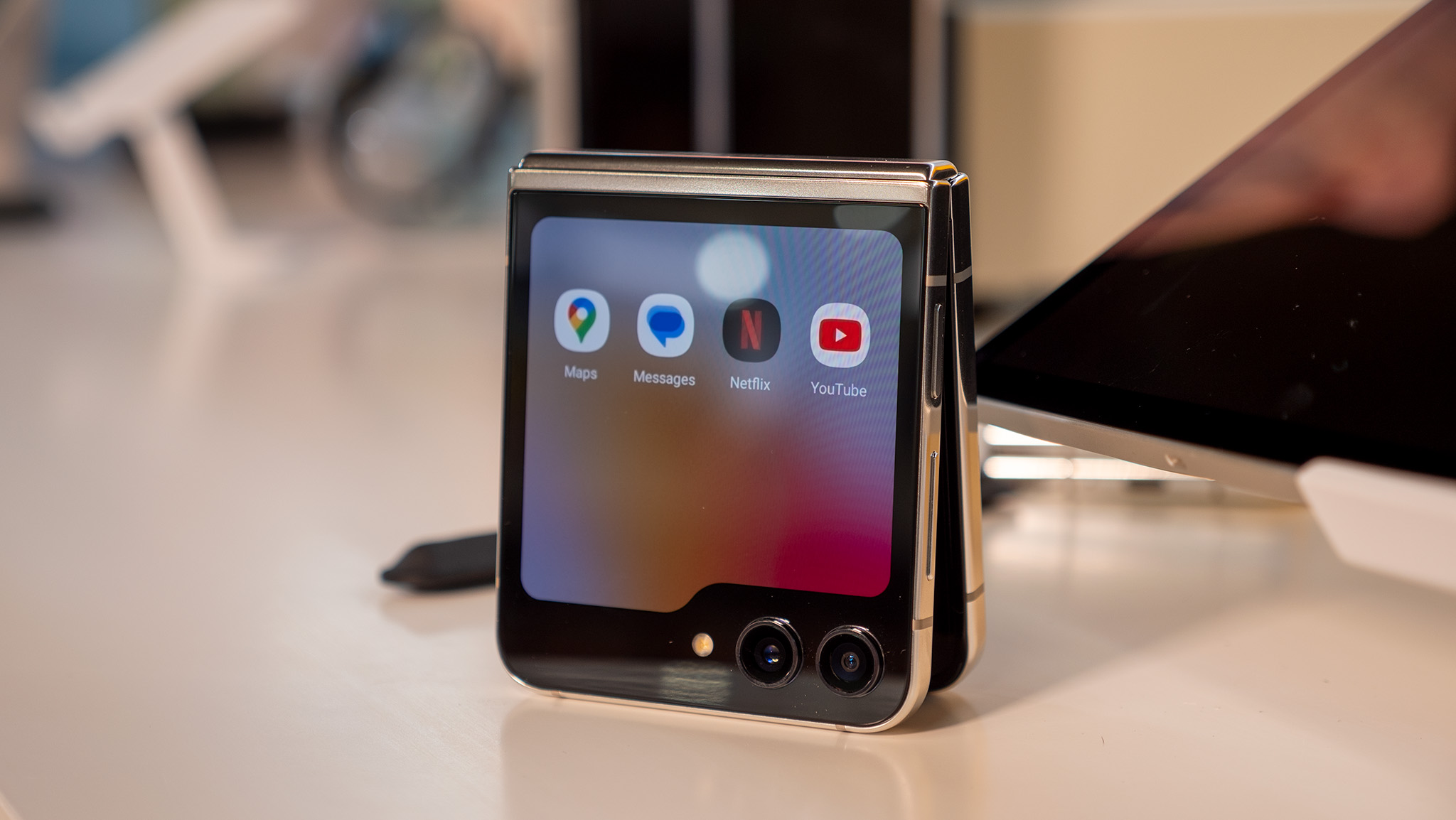
Coming back to the app situation, the Galaxy Z Flip 5 Flex Window doesn’t let you just open any app out of the box. As part of a “curated, optimized experience,” Samsung has a select number of apps that a user can access, but only when the widget is enabled through Labs (found in the Advanced settings menu). The apps available through this method are limited to about six: Google Messages, Samsung Messages, WhatsApp, YouTube, Netflix, and Google Maps.
It’s nice that Samsung gives users a somewhat accessible way to use these apps from the cover screen. However, I’m not really sure what’s so special about these select “optimized” apps versus what I’ve used on the Razr Plus, which doesn’t really rely on any optimization or curation. In my experience, these apps function more or less the same on both phones, making me question why Samsung is trying so hard only to limit the app selection in the process.
It seems more apps may eventually be available via Labs, but I still can’t imagine why Samsung is going this route.
Hiding behind Good Lock
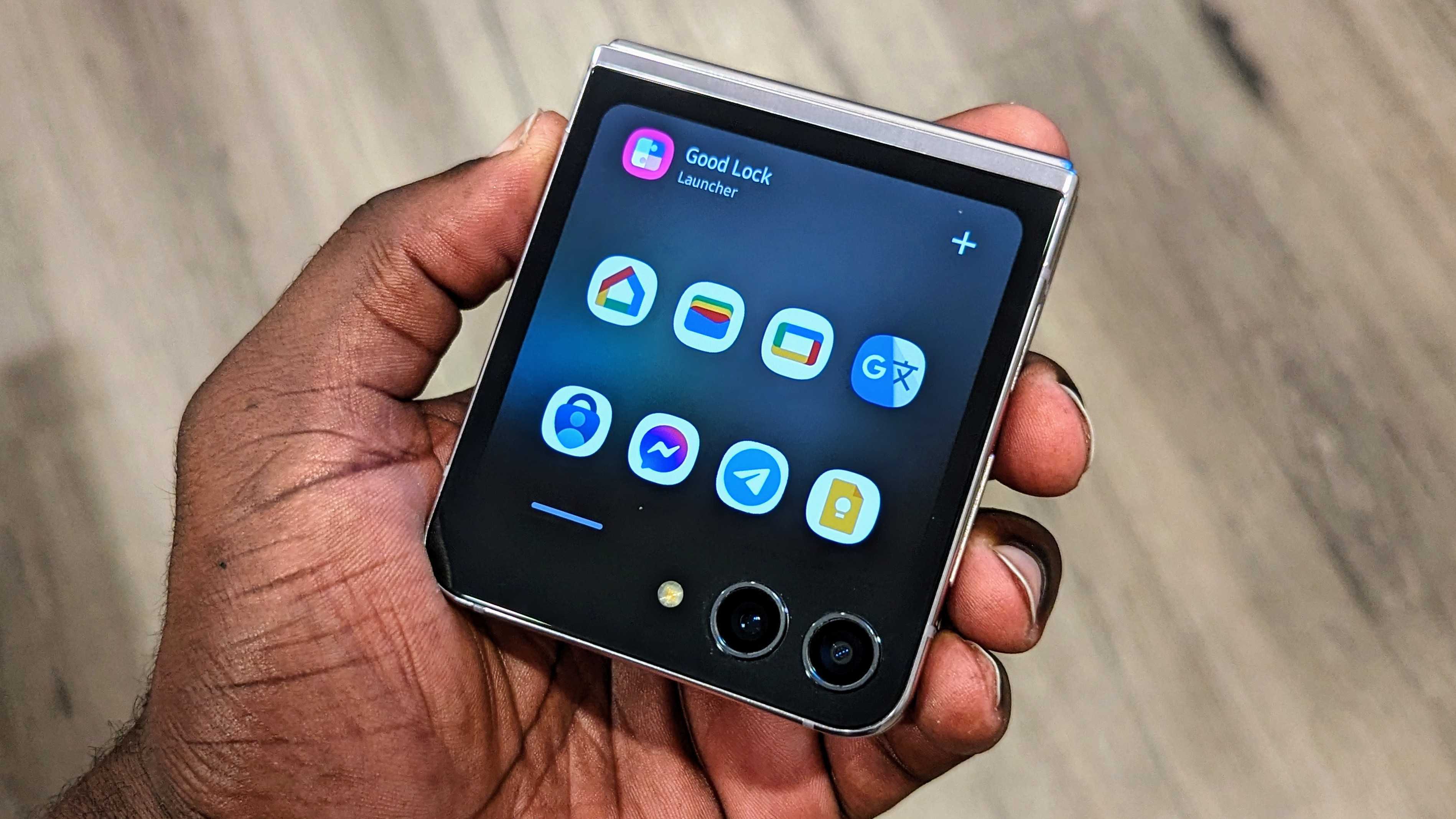
There is another option in case you want to have the Razr Plus experience on your Galaxy Z Flip 5. Samsung has a widget for a Good Lock app launcher that lets you open nearly any app from the cover panel. It works surprisingly well and even improves the notification experience a bit, so in many cases, I can tap a notification and just open the respective app.
However, it’s not perfect, and Samsung hides this feature annoying well. We have a guide on how to customize the cover screen on the Galaxy Z Flip 4, which enables the cover screen app launcher and also works on the Galaxy Z Flip 5. That said, it requires you to download Good Lock from the Galaxy Store, find and install the MultiStar module, and enable a specific (and annoyingly-named) setting.
Then, after selecting the apps you want to appear, the launcher can be enabled on the cover screen, separate from the Labs-enabled app launcher. That means you have two app launchers on your cover screen, which looks just messy.
It’s also a process that takes too many steps and isn’t really obvious if you don’t know where to look or even what to look for. Samsung isn’t exactly hyping this up as an option for users, and it should, while also working to make it more readily available as an out-of-the-box experience.
Getting all your apps to work on the Galaxy Z Flip 5’s cover screen is a bit of a process.
Samsung also needs to work on app continuity. This is one of the best parts about using the Razr Plus and other foldable phones. When using an app on the cover screen, opening the phone will keep the app open on the main display. In the opposite situation, closing the phone will prompt you to open the app on the cover screen if you want, or you can set an app to automatically open on the external display. With the Z Flip 5, it will do the former but not the latter, which is kind of a bummer.
There’s also no way to easily swap between open apps on the cover screen, which seems like a huge missed opportunity. While I’m in an app, I often find myself swiping up from the home bar and expecting to see my open apps, but that never happens. I have to minimize an app and open the next one, which is a fairly small annoyance but one I run into daily with the cover screen.
Oh yeah, and Google Wallet is pretty much non-existent on the cover screen, which has been pointed out by others. Tapping the app icon on the cover screen will simply prompt you to open the phone, which is not that big of a deal, but its still a nuisance when it works just fine on the Razr Plus. You can still use Google Wallet with the Galaxy Z Flip 5 closed, but none of the UI elements appear when you tap to pay, which is a little jarring. It just feels like Samsung is trying to get you to use Samsung Wallet, which is available from the cover screen, but c’mon.
The potential is there
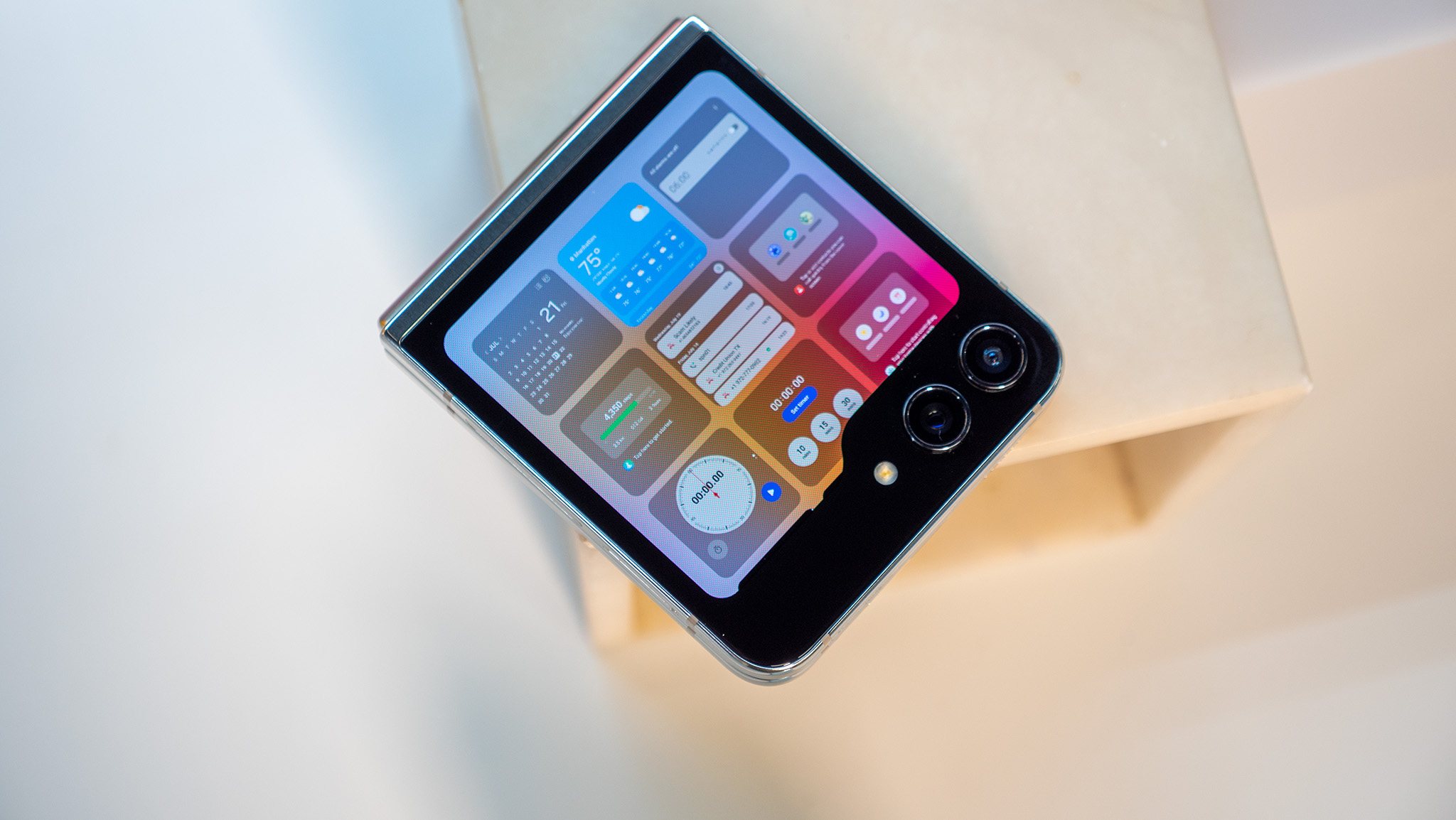
While there’s plenty to complain about regarding Samsung’s 60Hz OLED cover display, some bright spots make it at least a somewhat enjoyable experience. For one, the display is very bright, with a peak brightness of 1600 nits. That makes it incredibly easy to see while out and about and even in direct sunlight.
The widgets are actually pretty great, and while there isn’t an extensive amount to choose from, Samsung still gives you just over a dozen to choose from. So far, the ones I found are all powered by Samsung apps, so it would be nice to see some third-party widgets in the mix, but apparently, support is there.
There’s also a cool gesture that lets you view all the widgets at once. The UI is slick and just requires a pinch on the cover screen, which displays a grid of all your available widgets. It’s really nice and something I would really like to see on other Android skins.
Samsung still gets a lot of things right when it comes to the Galaxy Z Flip 5 cover screen.
Samsung includes plenty of interesting clock screen options that you can customize, and there’s even an Always On Display for those who like that. I also like the media UI that materializes a small pill in the display notch when you’re playing music or a video, as well as a separate widget for media control.
And while I complain about the initial setup process requiring more effort that the average consumer should have to deal with, I find that the actual experience of running full apps on the cover screen is actually not bad. You just have to get used to everything being condensed, but most apps should work more or less as intended, which is pretty great.
Using the cameras with the cover screen is also a pretty awesome experience, and you can choose from a few modes and settings to capture images and video from the primary cameras. I haven’t had much time to test this on my own, but so far, I like what I see.
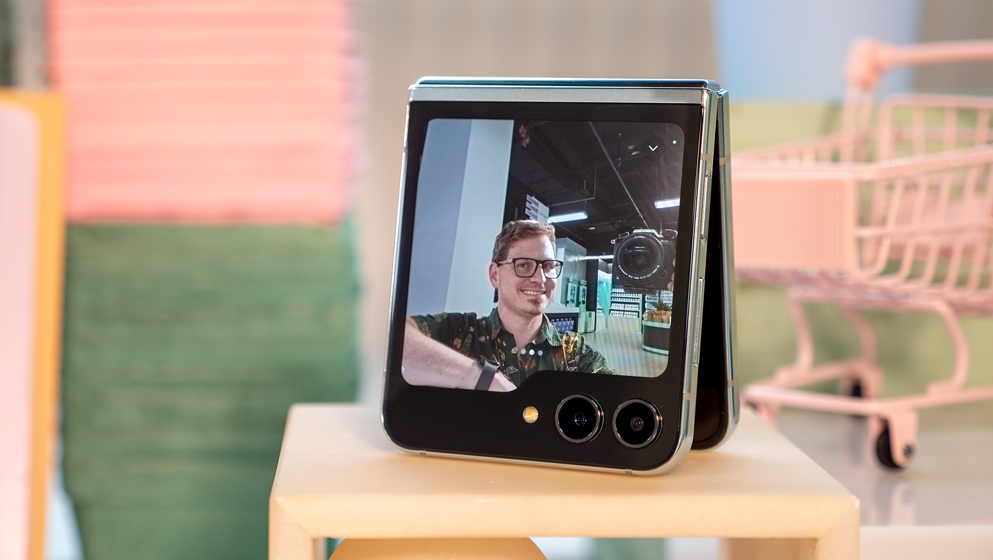
It’s clear there is a lot of potential with the cover screen, and Samsung is just scratching the surface. Unfortunately, it seems like the company is intentionally holding itself back for some unfathomable reason. I understand Samsung isn’t used to having much competition in the foldable space, at least in the United States, but times are changing, and Samsung has to do more than just give us a bigger screen.
Motorola has gone all-in on the cover screen for the Razr, giving it overly impressive specs and the proper software to make it feel like you have two phones in one. Samsung would be wise to do the same because, so far, I find that I’m not as excited to use the Z Flip 5 cover screen as I am with the Razr, which to me, is the biggest draw of having a clamshell foldable.
For now, I’ll continue testing the Galaxy Z Flip 5 cover screen further ahead of my full review of the phone, which you can expect fairly soon.
