What you need to know
- WhatsApp might be getting a fresh new look, with a white top bar and green accents.
- New chat filters are apparently coming as well, making it easier than ever to stay organized.
- These upcoming changes have been spotted in the latest beta version of WhatsApp on Android (version 2.23.18.18).
WhatsApp is about to get a major facelift, and it’s going to make your chats way easier to manage and give the app’s main interface a new look, says a new report from WABetaInfo.
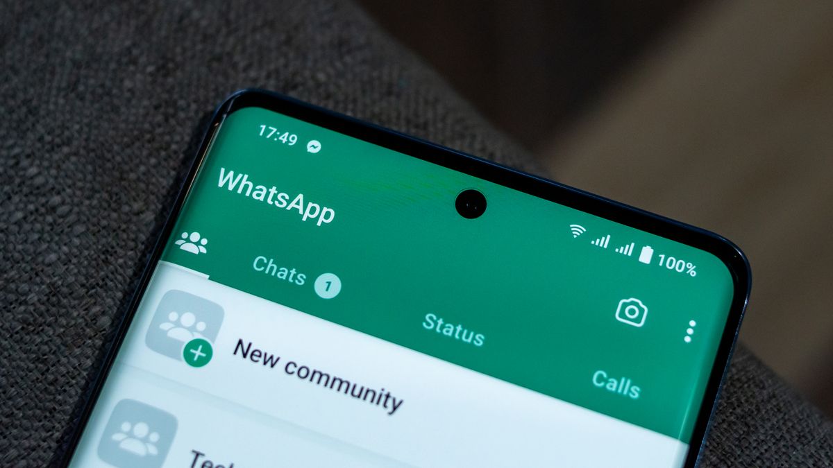
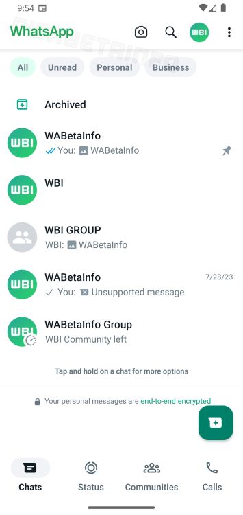
The upcoming changes were spotted in the latest version of WhatsApp for Android on the beta channel (version 2.23.18.18), introducing a white top app bar and new green accents for the app logo. As a result, the WhatsApp logo in the app bar changes from white to green.
WABetaInfo says this makeover is currently in progress and will be released in a future update. It appears Meta has been working on this redesign since at least June, when the white action bar was first observed. What’s new in the latest discovery is an additional menu button to the right of the profile picture.
When it is finally released, the new tweak will breathe new life into the app’s main UI, which has remained largely unchanged over the years. WhatsApp has always been adding new features and changing things up, although many of them mostly involved functionality tweaks meant to keep pace with the top messaging apps.

Another major change that Meta may be planning appears to be quite significant, and it has the potential to alter how we use the app. WABetaInfo previously reported about new filters that will make chat organization a whole lot better. You’ll apparently be able to filter your chats by unread, personal, or business.
The new sighting reveals that the buttons for those filters have more rounded edges than when they were first spotted. While these changes are currently seen on the app’s Android version, the report notes that it’s likely the iOS version will get the same treatment when the update rolls out.
